
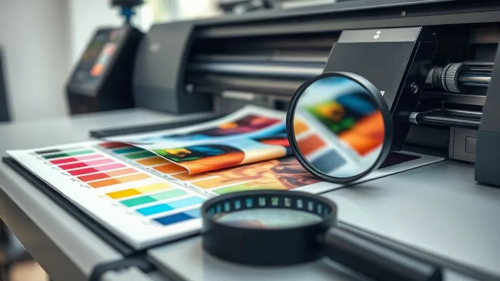
When you first start with dtf transfers, it's tempting to focus on the hardware: the printer, the powder, the press. But the real magic happens long before the platen closes. Color accuracy and fine detail are what separate a print that looks "good enough" from one that makes customers do a double-take. In this guide, we'll dig into the less obvious levers you can pull to get richer color and crisper detail from your DTF workflow, without buying new equipment.
Why Color and Detail Are the Real Differentiators in DTF
DTF printing has democratized custom apparel, but it's also raised expectations. Customers see ultra-sharp Instagram ads and expect their own designs to look just as vivid. The difference between a mediocre transfer and a stellar one often comes down to how you handle color profiles, ink density, and design resolution. Get these right, and even a modest setup can produce results that rival more expensive processes.
The Foundation: Color Management That Actually Works
Most DTF printers ship with generic ICC profiles. They're a starting point, not a solution. To get consistent, accurate color, you need to build a custom profile for your specific printer, ink, and film combination. This might sound intimidating, but it's simpler than it seems. Start by printing a standard color target (like the IT8.7/4) on your usual film, then use a spectrophotometer or a profiling service to generate a profile. Yes, it costs a bit, but the payoff in reduced waste and happier customers is immediate.
Soft Proofing: See Before You Print
Once you have a profile, use it to soft-proof your designs in Photoshop or Illustrator. This simulates how colors will appear on the final transfer, accounting for the film's white base and the powder's texture. You'll spot out-of-gamut colors early and can adjust before wasting film and ink. A quick soft-proof check takes seconds and saves dollars.
Ink Limits: The Unsung Hero of Color Vibrancy
More ink doesn't always mean better color. Over-inking leads to bleeding, longer curing times, and a stiff hand feel. Under-inking gives you washed-out prints. The sweet spot varies by fabric and design, but a good rule of thumb is to keep total ink coverage below 240% for white areas and below 280% for dark garments. Use your RIP software's ink limit tool to test patches and find the maximum density that still cures properly. You'll often find that reducing ink by 10-15% actually improves color saturation because the powder adheres more evenly.
Design Tactics for Sharper Detail
Detail in DTF is limited by the film's resolution and the powder's particle size, but you can optimize your artwork to make the most of what you have. Here are key adjustments:
- Resolution: Aim for 300 DPI at final print size. Upscaling low-res images won't add real detail; it just blurs edges.
- Halftones and Gradients: DTF handles gradients well, but very fine halftones (below 10% dot) may not reproduce. Convert tiny dots to solid areas or use a coarser line screen.
- Text: Avoid fonts with hairline strokes. If you must use them, add a slight stroke (0.25 pt) to prevent dropout.
- White Underbase: For dark garments, a white underbase is essential. But keep it tight to the color areas; excessive white base can cause a halo effect around fine details.
These tweaks are especially important if you offer dtf transfers near me services with quick turnaround, where reprints are costly.
Mastering the Powder and Cure for Color Integrity
Powder application directly affects color vibrancy. Too little powder and the ink won't bond, leading to wash-out. Too much and you get a rough, dull surface. The goal is a thin, even coat that saturates the ink but leaves no excess. Shake off excess powder gently and cure until the powder melts completely (typically 160-170°C for 60-90 seconds). Overcuring can yellow the white ink and shift colors, so use a infrared thermometer to verify film temperature.
Choosing the Right Film for Your Color Goals
Not all DTF films are created equal. Matte films tend to hold finer detail and reduce glare, while glossy films can make colors pop but may show artifacts. For high-detail work, try a matte film with a high release coating. Also consider film thickness: thinner films conform better to textured fabrics and reduce the "plastic" feel, but they can be trickier to handle. Test a few options to see what works with your printer and typical designs.
Real-World Example: Reviving a Faded Logo
A small print shop recently struggled with a client's vintage logo that looked muddy on dark shirts. The original file was a low-res JPEG. Instead of simply upscaling, they redrew the logo as vector art, simplified the color palette to five spot colors, and used a custom ICC profile to ensure those colors matched the brand's Pantone references. They also reduced ink coverage by 12% and switched to a matte film. The result was a crisp, vibrant print that exceeded the client's expectations. The lesson: invest time in file prep and color management, and the dtf process will reward you.
SSS
How can I improve color accuracy in DTF transfers without expensive equipment?
Start by calibrating your monitor and using the printer's generic ICC profile as a baseline. Print small test patches of critical colors and adjust your design files accordingly. Free tools like the ColorMunki Smile or community-shared profiles can help, but a custom profile from a service is the most reliable upgrade.
What's the best way to handle gradients in DTF printing?
DTF handles gradients well, but avoid very fine halftones. Use a coarser line screen (e.g., 45 lpi) and ensure your gradient has enough steps to avoid banding. Soft-proofing helps you see how the gradient will translate to film.
Why do my DTF prints look dull after washing?
Dullness after washing usually indicates under-curing or insufficient powder. Ensure the powder is fully melted and the ink reaches the correct temperature. Also, wash garments inside out in cold water and avoid fabric softeners, which can coat the print.
Can I use DTF transfers on dark colors without a white underbase?
No, a white underbase is essential for opacity on dark fabrics. Without it, colors will appear muted or tinted by the garment. However, you can minimize the underbase in areas where the design is white itself to reduce stiffness.
How do I find reliable DTF transfers near me?
Look for local print shops that specialize in DTF and ask for sample prints. Check reviews and request a wash test sample to verify durability. Many online services also offer fast shipping, so "near me" can include reputable suppliers with quick turnaround.